Produces a heatmap showing the marker percentages within each cluster and the cluster sizes.
plot_composition_heatmap(
  composition,
  pheno_to_exclude = NULL,
  log_values = FALSE,
  feature_colname
)
Arguments
- composition
Data.frame. Output from
composition_of_neighborhoods.- pheno_to_exclude
String Vector of phenotype to exclude.
- log_values
Boolean. TRUE if the percentages should be logged (base 10).
- feature_colname
String. Column with cell types.
Value
A plot is returned
Examples
neighborhoods <- identify_neighborhoods(image_no_markers, method = "hierarchical",
min_neighborhood_size = 100, cell_types_of_interest = c("Immune", "Immune1", "Immune2"),
radius = 50, feature_colname = "Cell.Type")
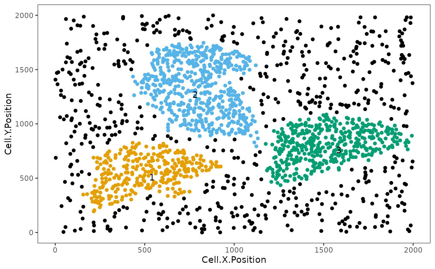 neighborhoods_vis <- composition_of_neighborhoods(neighborhoods, feature_colname="Cell.Type")
plot_composition_heatmap(neighborhoods_vis, feature_colname="Cell.Type")
neighborhoods_vis <- composition_of_neighborhoods(neighborhoods, feature_colname="Cell.Type")
plot_composition_heatmap(neighborhoods_vis, feature_colname="Cell.Type")
